The Challenge
This project needed to be done during a short period of sprints, so my team was under lots of pressure to move quickly. Many meetings discussing features within Lesson Builder helped to narrow down our goals, and rate the features based on their value, UX and design effort, and technical complexity. The primary objective was to deliver an experience that was simplified, yet keeps familiarity for the user within the app.
Discovery
While lesson builder was rich in features, it focused on features that were secondary to the primary use case of the user building experience: building lessons and delivering them fast. The team and I decided to focus on the toolbar to elimate any obstacles that may have impacted development timelines.
Ideas
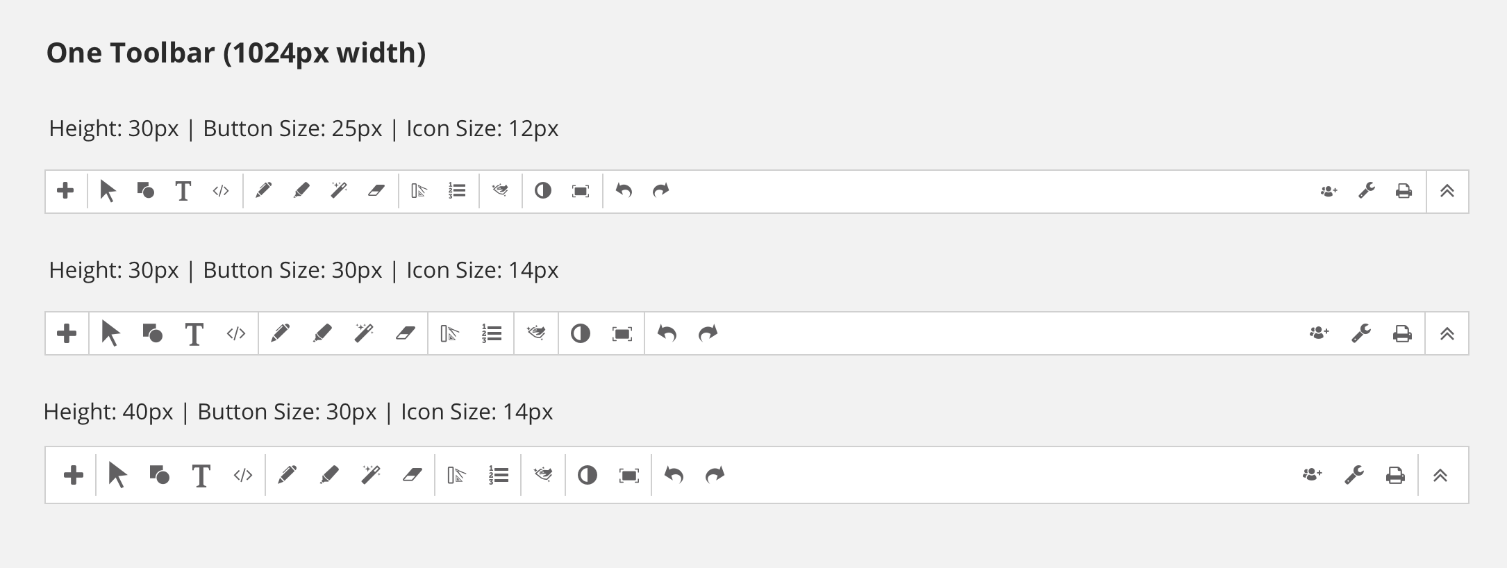
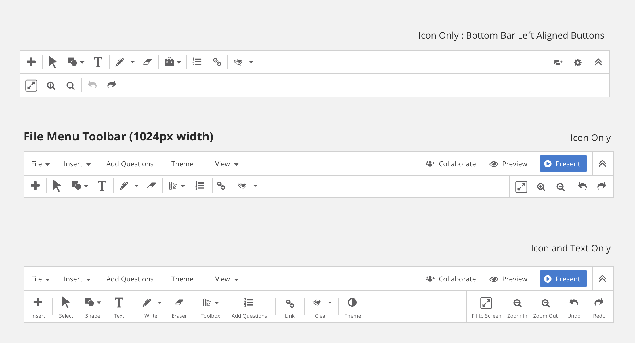
There were many iterations to go through to determine which toolbar would fit best within the application. Single row versus double row toolbar; small icons vs large icons; text or no text.
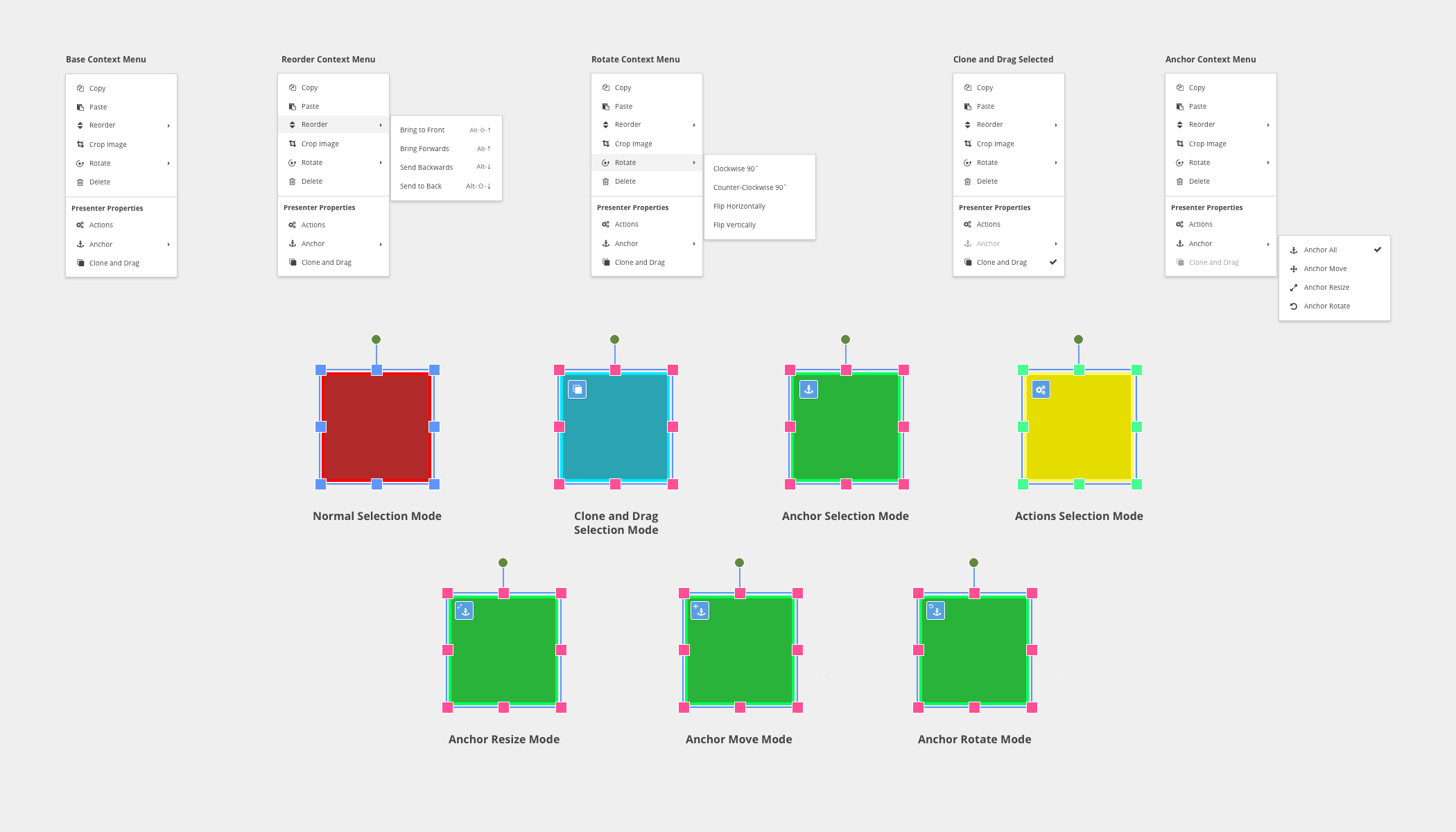
Hi-Fi Mockups
With limited time allotted, hi-fi mockups were created and passed over to project management to ensure requirements were met for development. We opted for a clean and minimal need for learning the in the new interface by creating an experience that mimics applications teachers are familiar with like Microsoft Powerpoint.
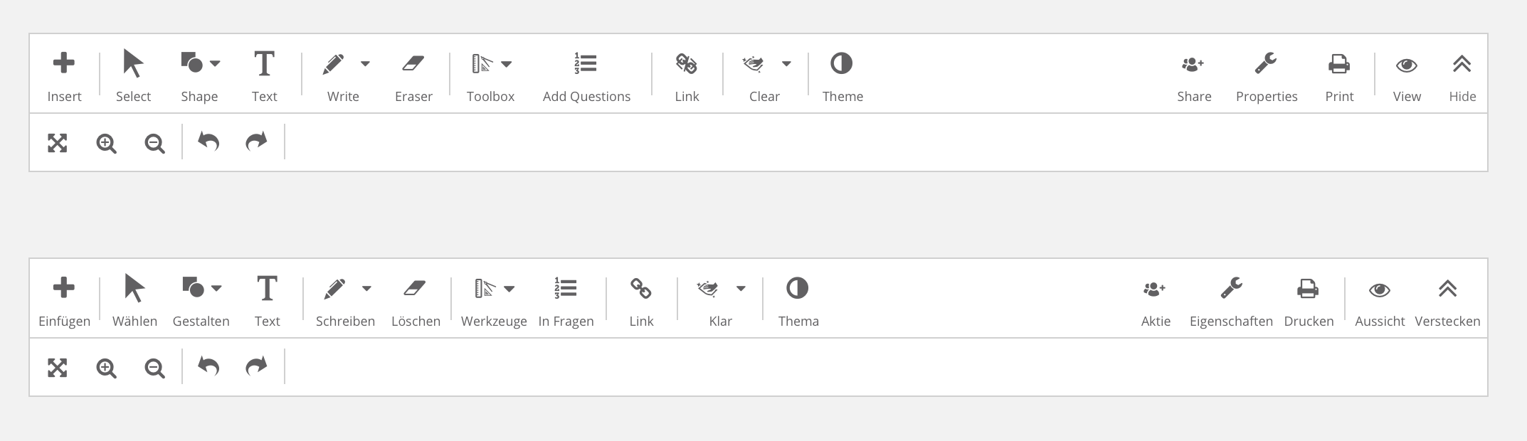
Toolbar Varients
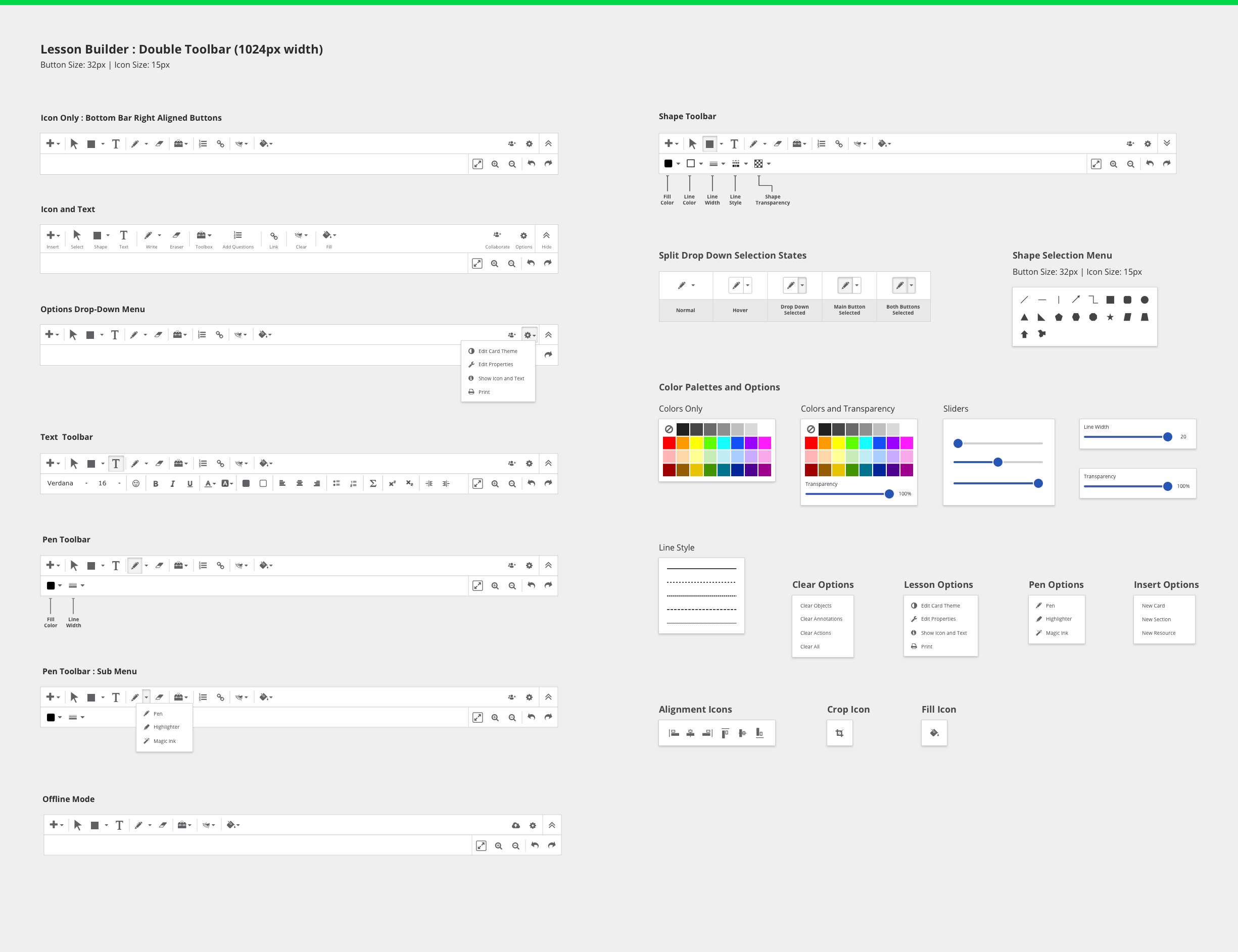
Context Menu
 Back to Projects